

Bitcoin’s price chart now repeats the same patterns over and over. The rallies, the drawdowns, the headlines, all echoes of 2017 and 2021. But, one thing constantly changes, the people moving the coins. Fewer everyday users are actively transacting, and the coins landing on exchanges are increasingly coming from a small handful of very large holders. Two on-chain numbers make this visible, the activity retention, and the whale ratio. Combined, they tell a simple story of Bitcoin being run by a different crowd than it used to be.
The Metric Nobody Talks About: Activity Retention
Most crypto dashboards show “active addresses.” It’s a popularity number. What it doesn’t tell you is whether those are the same people showing up again and again.
That’s what Glassnode’s Activity Retention Rate is built to catch. Out of the addresses active in the last 30 days, what shares are still active in the next 30? A high number means a stable core of repeat users, while low number means the network is full of visitors.
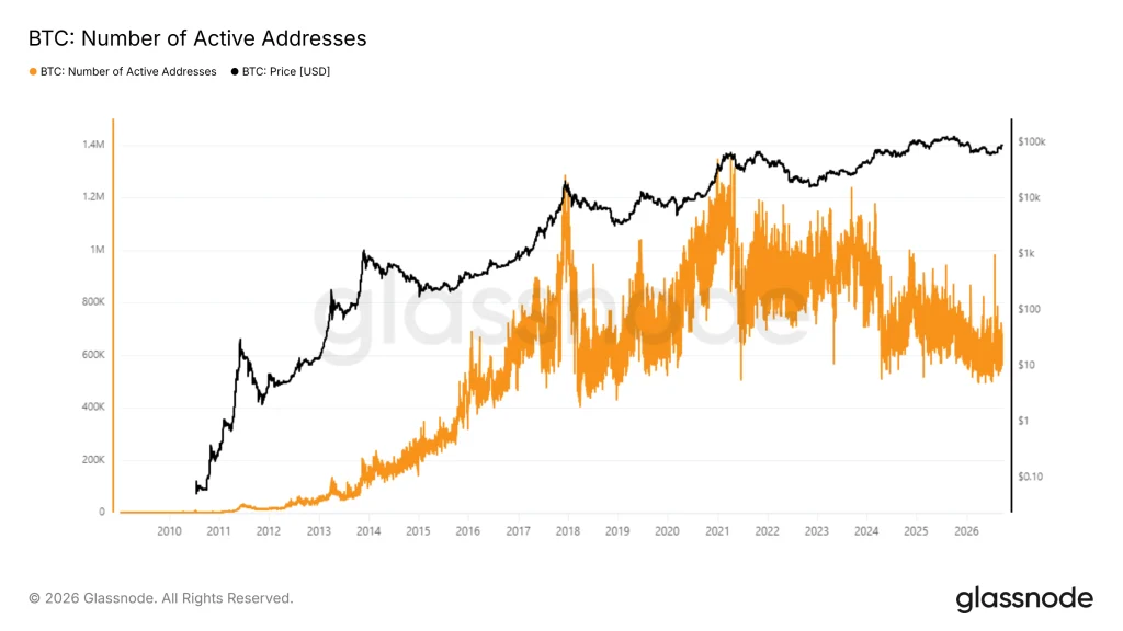
During the 2017 mania, daily active addresses climbed into the high hundreds of thousands and beyond, a level not seen again until Bitcoin’s price rally years later pushed activity back over 1 million addresses a day. By 2021, activity spiked even further, with daily active addresses staying above 1 million for multiple consecutive days as prices pushed toward new highs near $67,000.
Both spikes look impressive on a chart, but what followed was mass departure. By mid-2022, Glassnode found that both active addresses and active entities had been in a downtrend since November 2021, with daily active addresses falling from over 1 million in November 2021 to around 870,000. The active entities dropped to roughly 244,000 a day, which the firm described as sitting near the low end of the range typical for bear markets.
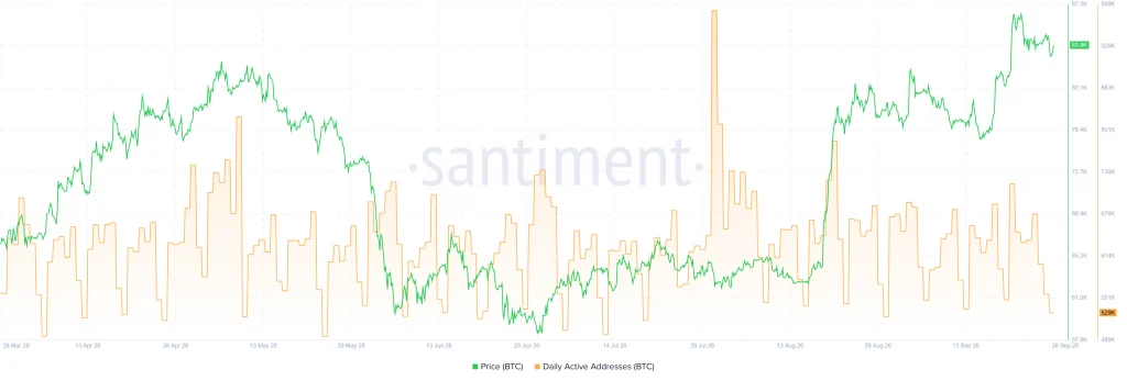
But a look at those charts from multiple aggregators like Glassnodes, Look Into Bitcoin and Sanbase shows the same pattern of peaks in active addresses during price peaks in 2017 and 2021.
Glassnode noted that this was a purge of “tourist”-type investors, while the users who remained showed real staying power.
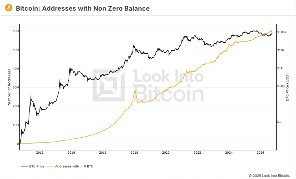
That staying power showed up in a different number entirely. Even as active addresses fell, the number of wallets holding at least some Bitcoin kept climbing to new all-time highs, passing 42.3 million. At the same time, small holders were accumulating BTC at close to 60,500 coins a month, which the firm called the most aggressive accumulation rate in Bitcoin’s history.
Put together, that’s the retention story in one sentence: the crowd that flooded in during the bull run mostly left, but the people who stayed became more committed, not less.
Who’s Actually Sending Coins to Exchanges Now?
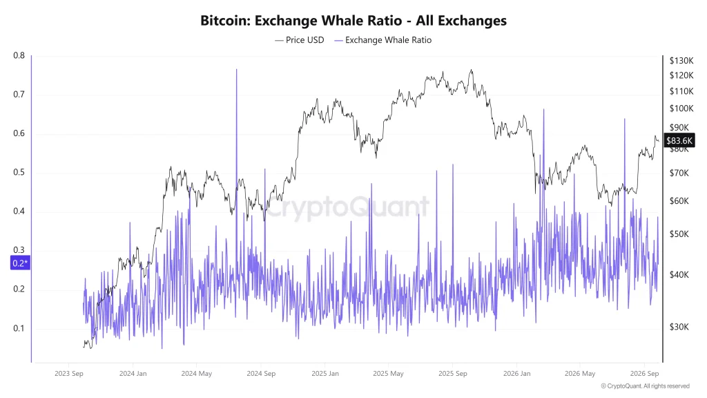
If retention tells you who’s still around, the Exchange Whale Ratio tells you who’s making the moves that matter. CryptoQuant’s version of this metric takes the 10 largest Bitcoin deposits into exchanges over a period, and divides them by the total amount deposited. If the ratio is 0.5, it means half of everything hitting exchanges came from just 10 transactions.
In February 2026, that ratio hit 0.64, signalling that large holders accounted for 64% of all Bitcoin exchange deposits by volume, the highest reading since October 2015.
It wasn’t just the ratio. The average Bitcoin exchange inflow per transaction climbed to 1.58 BTC in February 2026, the highest since June 2022. This was another sign that deposits were coming in bigger, more deliberate chunks rather than a broad wave of small retail sales. CryptoQuant noted that this pattern echoed distribution behavior seen in past bear phases, where large holders lead the selling rather than retail panic.
The backdrop makes the whale-led move even more notable. Following Bitcoin’s correction toward the $60,000 area in early February 2026, total exchange inflows spiked to around 60,000 BTC on Feb. 6. This was the highest daily level since November 2024. Later, it fell to about 23,000 BTC on a seven-day average, a roughly 60% decline.
Meanwhile, daily net Tether inflows into exchanges fell from a one-year high of $616 million in November 2025 to just $27 million. On some days, it even turned negative.
Then vs. Now: Two Different Bitcoins
2017 and 2021 looked like genuine retail stampedes: address counts spiking to new highs, huge numbers of new wallets created, and exchange inflows spread across a wide base of small buyers and sellers riding the hype. People arrived fast and left just as fast once prices turned.
2024 through 2026 looks structurally different. Active user counts have struggled to make new highs even as prices moved higher, pointing to a smaller pool of habitual users. And the coins that do move to exchanges are dominated, more than at any point in a decade, by a tiny number of large transactions.
Why This Actually Matters
When a market is whale-dominated and retail participation is thin, price swings can be sharper and less predictable. Just a few large wallets can move markets in ways that millions of small retail trades never could.
Rising prices no longer automatically mean rising numbers of everyday users. For anyone trying to understand where Bitcoin’s next move might come from, watching who’s actually active is the more honest way to read the market.

Dan is a seasoned crypto writer for Blockchaindose who got his start in the space back in 2019. Over the past four years, he’s built a solid grasp of how the industry moves, focusing heavily on DeFi, NFTs, GameFi, and promising new projects.
Off the clock, you’ll usually find him buried in a good book or kicking back with a movie. His blend of hands-on market experience and straightforward commentary makes him a clear, trusted voice across the platform.